This article was originally posted on Smashing Magazine. This is my local
backup :)
As someone who has worked with beginner designers for
decades, I have observed a certain common problem. They
often get overwhelmed with design tasks such as creating
presentations, a personal website, mocking up an app
idea, or even making menus or cards. It’s not due to a
lack of ability and skills, but rather because of an
unfamiliarity with the rules and systems which graphic
designers are trained to understand.
To fill this gap, I have compiled some simple
principles that are quick and easy to learn, yet can
greatly enhance any design project. In this article,
we’ll focus on the four key elements of good
design:
Structure
Spacing
Rhythm
Contrast
By learning these simple concepts, anyone should be
able to create effective designs that not only look good
but also cater to diverse audiences, including those
with disabilities. Are you ready to learn the power of
these fundamental design concepts? If yes, follow me
along!
Structure
Structure helps people absorb information. You see
the toolbar before you can discern any
individual tool in it. You recognize a form
before you can identify a specific field in it.
The right structure helps you access the information
faster. It’s the main menu, the selection screen before
you dive in.
Let’s review an example. Imagine you are making a
registration page for a webinar. The webinar page should
contain the following information:
The event title
A short synopsis
The price of admission
The time and date of the event
The name of the host
A photo of the host
A short bio for the host
Some social links for the host
A register button
A call-out: “Join me live!”
Ask yourself: If you had to group those things into
several groups/buckets, what would those be? How would
you name each group/bucket? Here are the groups I would
make — and it might not be precisely how you would group
the information, but that’s OK, the idea is to just give
you a start!
Headline
Host
Logistics
Call-out
Host name
Event date
Title
Host photo
Time & duration
Synopsis
Host bio
Price
Social links
Register button
Now that we have those buckets, let’s continue: In
what order do we want the audience to ingest them? My
choice would be: the headline first, then the logistics,
with the big register button. I would keep the host
information more as a detour, something optional to dive
in if you would like to learn more.
Compare these two versions. Isn’t it easier to ingest
the information in the one on the right?
Two versions side by
side: on the left, the page appears somewhat organized,
but the elements are disjointed and it’s hard to follow
the flow. On the right, the page has a sidebar with all
the host information, and a main content with all the
events related stuff
As you can see, the structure of the information
greatly influences your ability to absorb it. I will go
one step further. I believe beauty is an artifact of
well-organized information. In short, don’t try to make
something beautiful, try to make something
well-organized and watch the beauty emerge!
Spacing
Spacing in graphic design refers to the arrangement
of elements within a layout. Proper spacing can make
your designs more visually appealing and easier for
viewers to comprehend. It helps direct attention,
creates hierarchy, and improves legibility.
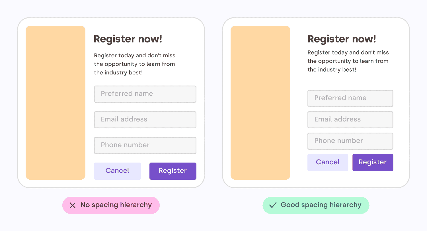
Let’s look at another example. On the left, all the
gaps are the same. On the right, the spacing is
influenced by the structure. The inner group elements
are more tightly grouped, creating a visible
“scaffolding” for the content.
Two versions side by
side: on the left, all the margins are identical. On the
right, the margins are proportional to how related
elements are. For example, the fields of the forms are
closer together than the elements outside the
form.
In print, space is expensive because paper is not
free. This is why in the past only “luxury magazines”
could afford those beautiful margins and airy layouts.
Nowadays, white space is virtually free. Luxury for
everybody!
The space must flow
Consistent spacing around elements gives visual
harmony and unity to your work. It ensures a coherent
look across all the components of your design. This is
because irregular gaps draw the viewer’s attention away
from the main focus, which is counterproductive. By
maintaining even spacing between all objects, you allow
the content to communicate without interference.
Here are some tips to create a nice flowing space
between and around elements.
Centering in a box
Sometimes you need to put an image (like a logo, for
example) inside a box. In this case, leave at least half
its shortest dimension as a minimum margin. E.g., if the
image is wide, use half its height as a minimum margin.
If the image is tall, use half its width.
Two versions side by
side: on the left, all the margins are identical. On the
right, the margins are proportional to how related
elements are. For example, the fields of the forms are
closer together than the elements outside the
form.
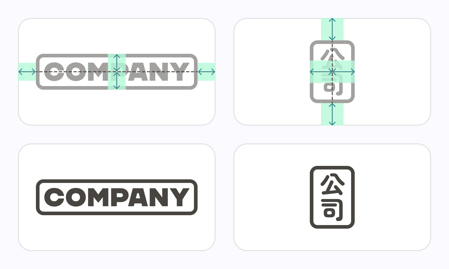
Vertically centering
text
Most of the text mass sits between the baseline and
the top of the lowercase letters — squint your eyes
slightly and you will see what I mean. When vertically
centering text, a good rule of thumb is to center the
lowercase letters’ height. In designer speech, it is
called the “x-height”. Some typefaces might need
a tiny vertical adjustment, but we’re going for simple
here.
Text properly centered in
between 2 lines, based on the height of the lowercase
letters.
Why is it called ‘x’ height? Because the letter ‘x’
is the only letter in the alphabet that has all its
terminals touch both the baseline and the meanline, with
no extending points. Curved letters such as a, c, e, o,
r or s usually pass the font’s x-height slightly.” Sirine Matta
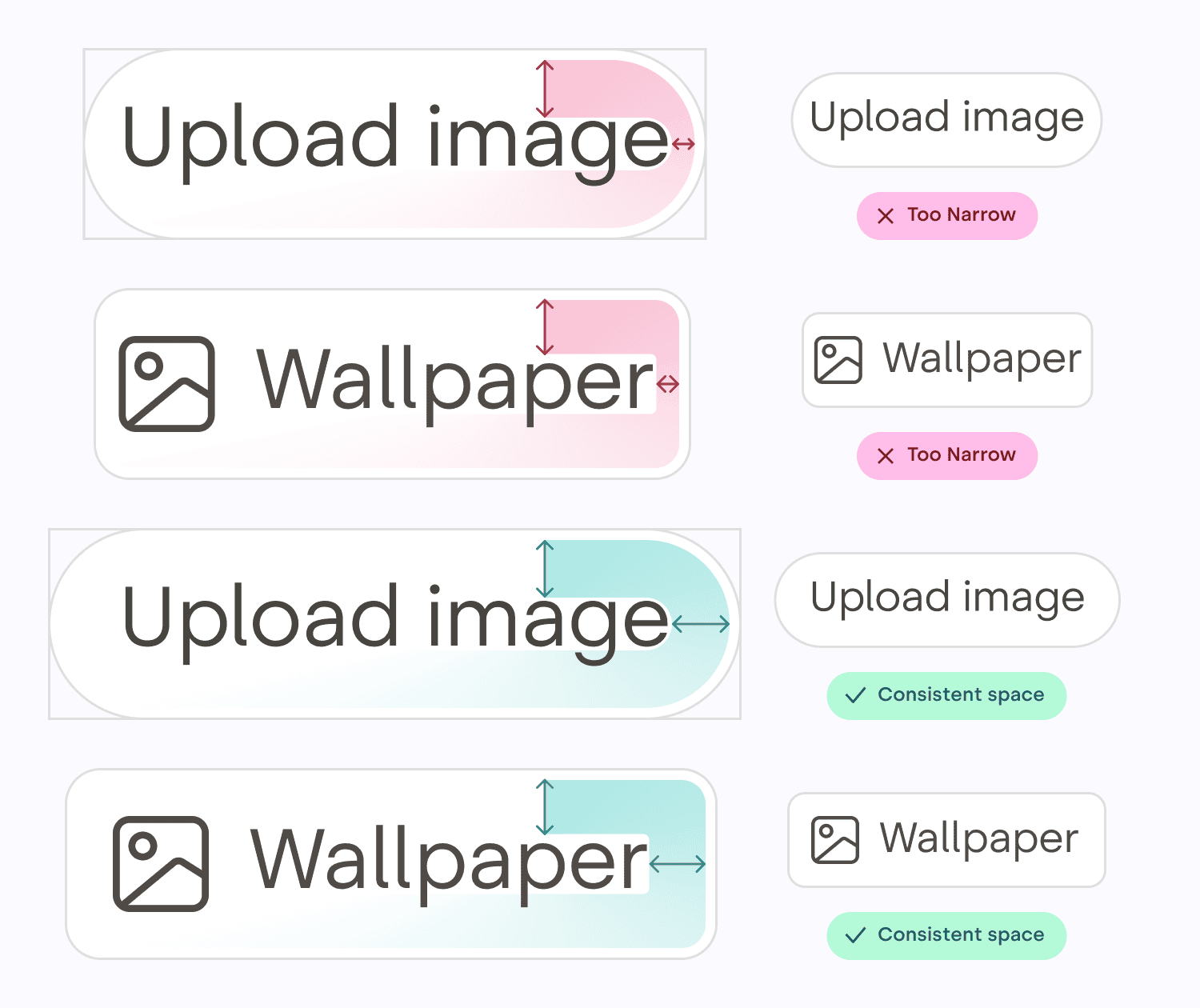
Text in a shape
When centering text inside a box (like a button or a
label), you need to use the height of the lowercase
letters to do the centering, and make sure there is the
same amount of space all around the text, not just above
and below.
Two sets of buttons. In
one set, the space is consistent above, below, leftward
and rightward. The other set has inconsistent spacing
around.
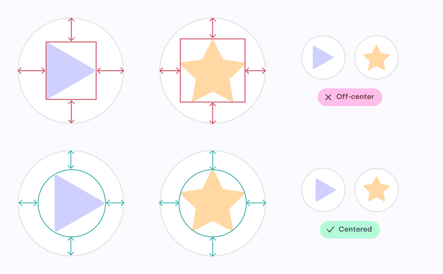
Centering polygons
When centering a polygon, center the circle passing
by each point instead of centering the box around the
polygon. Once again, this will ensure the space around
the shape is nice and uniform.
A 3-points polygon (a
play button) in a circle, with box-based centering and
circle-based centering. On another row, the same thing,
but with a 5-points polygons (a star)
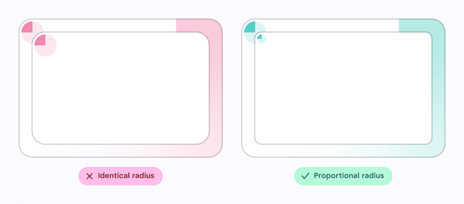
Nested rounded boxes
Rounded boxes are great. They don’t have sharp edges,
they feel more human, more organic. As if these digital
shapes have been sanded down, or eroded, like
pebbles.
However, when putting a rounded box into another one,
a mistake I have seen often is to use the same
border radius on the box outside and the box
inside. If you do this, the band (represented here with
a colored gradient) will not have a consistent width.
Instead, you need to use proportional radius
when doing such rounded boxes nesting.
Two rounded corner boxes
side by side, each containing an inner box. On the left,
the inner box corner radius matches the outer radius. On
the right, the inner radius is proportional to the size
of the margin. A gradient in each box highlights the
fact that the width of the canal is consistent on the
right, but not on the left.
Rhythm
Human eyes get bored quickly. To keep their interest,
you need to give them something new to parse and to
explore, at regular intervals. But you don’t want to
make it too hard either, too “new” every time. Just a
gentle walk along an interesting variety of
patterns.
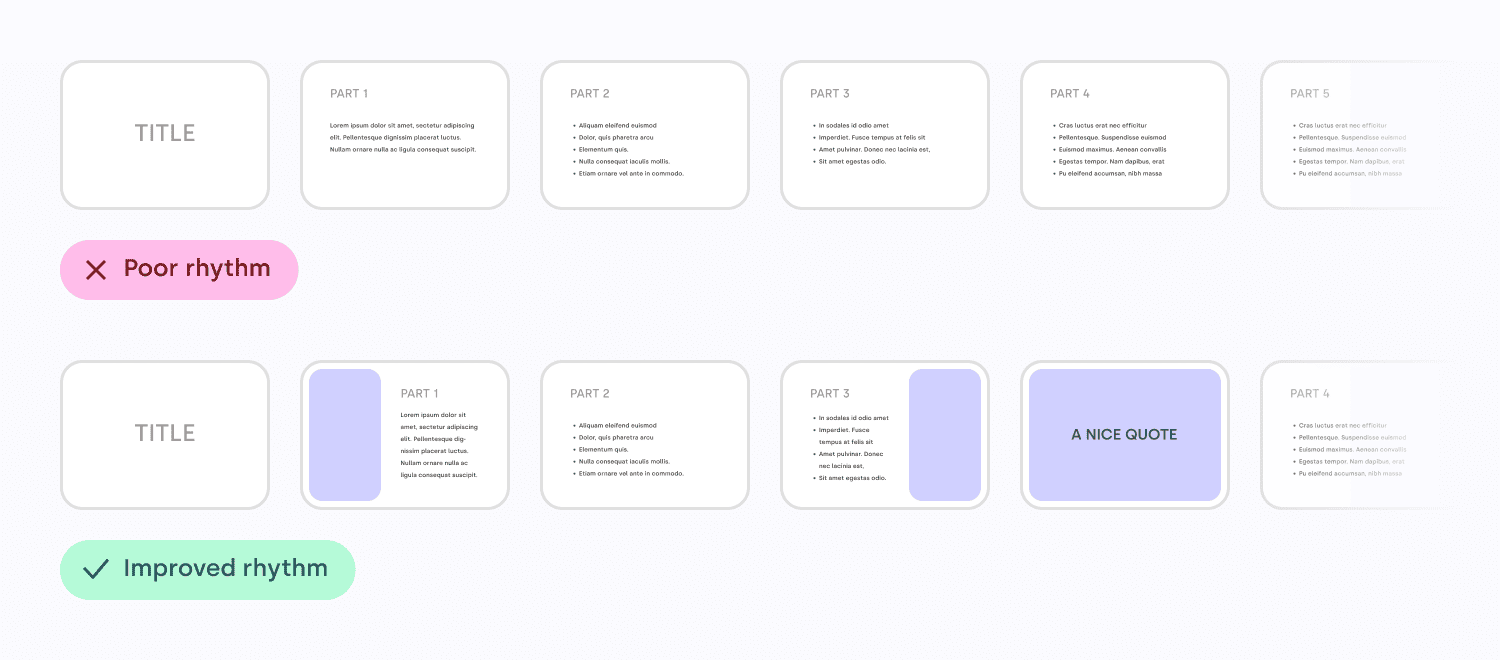
Rhythm contributes to a smooth flow that engages and
holds the viewer’s interest while communicating
effectively. A visual rhythm also provides directional
cues to guide readers through the content.
Well, if you think about it, your slide deck is the
same thing, and so is your portfolio, your app
on-boarding flow, and so many other things. Create
variety, constrained by a simple set of rules. Start
with just left and right, maybe one day try using thirds
if you feel comfortable. It’s not hard, you’ll see!
On top, a slide deck
where every slide is the same layout, versus at the
bottom, a slide deck where there is a variety of
alternating images and text, creating a nice
rhythm.
Repetition is key
to rhythm
Repetition is key to rhythm. Reusing elements such as
colors, shapes, and text styles can create a sense of
unity and coherence within your designs, making them
feel more organized and visually appealing. It also
makes your choices more intentional.
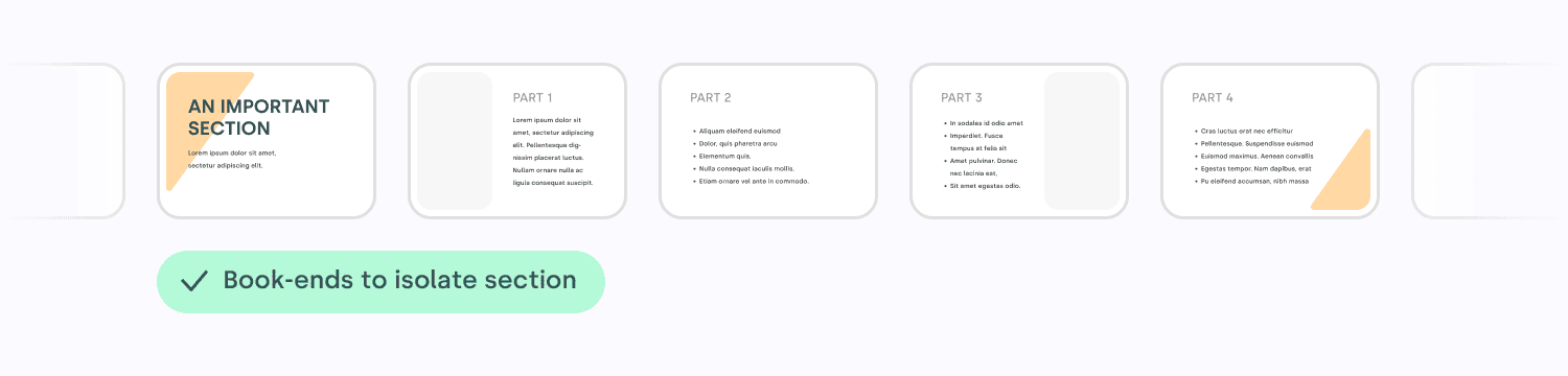
For example, I call a book-end any element
that can be repeated to signal the beginning and the end
of something. Shapes, colors, it’s a great way to
express creativity and bring some life to your content!
It helps to tell your audience that a topic has ended,
in a nice and subtle way.
A series of slides. The
first slide has a slanted gold-colored bar underneath
the title, in the top left. On the last slide, a hint of
the same bar can be seen in the bottom right, visually
suggesting the end of the section.
The repetition of certain visual elements creates
patterns that catch our eye, engage our brains, and hold
our interest, which can make any design feel more
dynamic, expressive and aesthetically pleasing. Find the
guitar riff of your content, find the chorus!
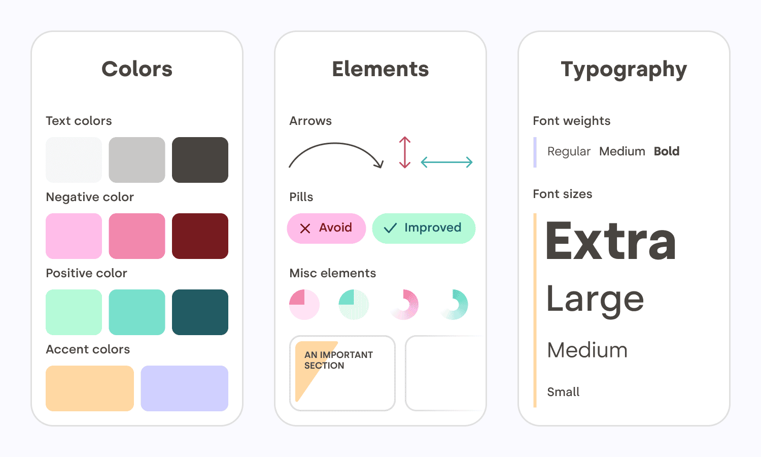
Here is a meta example. These are the elements I
reused throughout this article to create a sense of
unity between all the illustrations. I had to pick some
colors, decide on a style for the arrows, and many more
design choices. A bigger version of this is usually
called a design system.
Three panels
side-by-side. The first panel contains a collection of
different shades of colors, used across the article. In
the middle, a section composed of graphic elements like
arrows, the “avoid and improved” pills, and misc
elements like icons and gradients. On the right panel, a
waterfall of the 3 font weights and the 4 fonts sizes
used throughout this article.
Reading rhythm
When you are feeding words into people’s retinas, you
need to find the right compromise between the size of
text chunks, and the effort required to move the eye to
the next line. That sounds mechanical because… it kind
of is. Too long a line, and it is hard to locate the
beginning of the next line. Too short a line, and your
reading gets interrupted too often for an
eye-carriage-return.
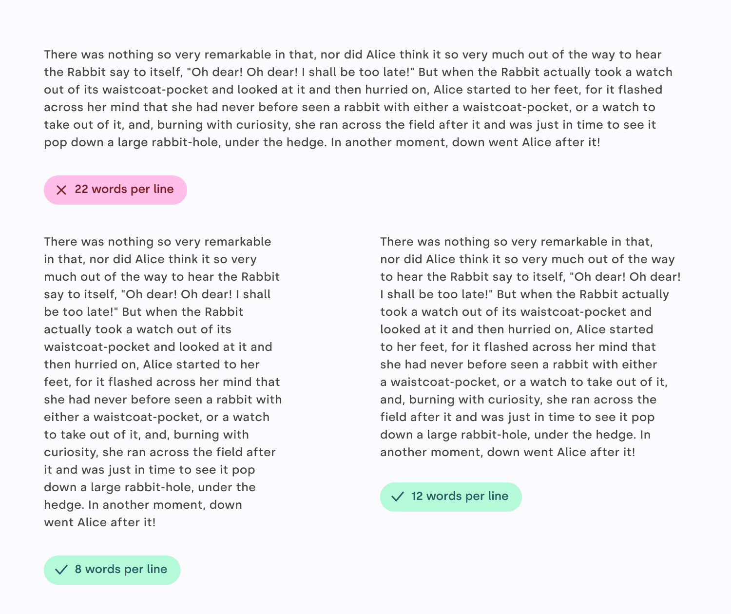
I usually find that between eight and twelve words
per line are a good goal for the main block of text.
Just count the words in a couple of sentences, no need
to be too strict. Also, keep in mind that it’s a good
rule for English, but other languages might have
different sweet spots. For a sidebar, a caption,
something narrower, you can aim for five to six
words.
Try reading some text in the example. You will see
how much easier it is for your eyes to follow when the
lines are not too long!
On the top, a paragraph
with very long lines (over 22 words per line).
Underneath, on the left a paragraph of text with 8 words
per line, and on the right a paragraph of text with 12
words per line. Both bottom paragraphs are significantly
easier to read.
Before going further, I’d like to quote Gary Provost,
an American writer and writing instructor, whose words
on rhythm are spot-on:
This sentence has five words. Here are five more
words. Five-word sentences are fine. But several
together become monotonous. Listen to what is happening.
The writing is getting boring. The sound of it drones.
It’s like a stuck record. The ear demands some variety.
Now listen. I vary the sentence length, and I create
music. Music. The writing sings. It has a pleasant
rhythm, a lilt, a harmony. I use short sentences. And I
use sentences of medium length. And sometimes, when I am
certain the reader is rested, I will engage him with a
sentence of considerable length, a sentence that burns
with energy and builds with all the impetus of a
crescendo, the roll of the drums, the crash of the
cymbals–sounds that say listen to this, it is important.
Gary Provost
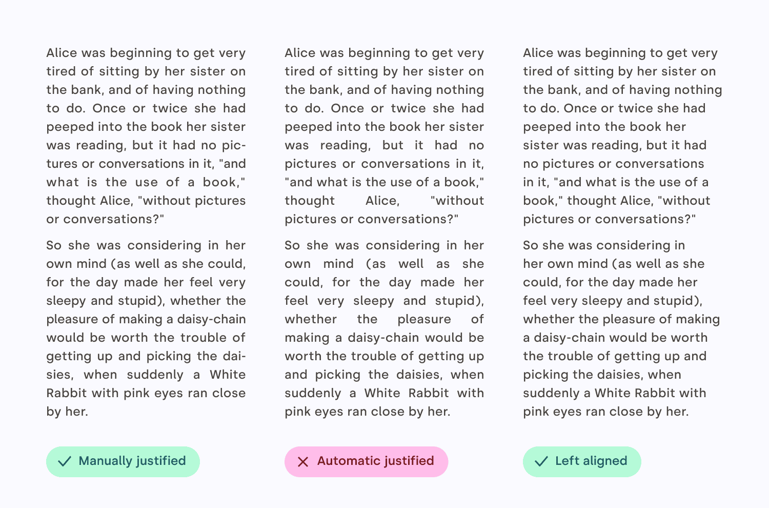
Not so justified
Justified text appears aligned on both sides. This is
a very desirable attribute, but it’s very hard for it to
naturally happen. Editing and design tools all do a
pretty bad job at creating justified text that looks
good. Instead, you will need to fine-tune letter
spacing, word spacing, use good hyphenation, and
sometimes even rewrite your text. Your job is to avoid
text gaps that will hurt the pace of reading.
So, unless you spend the time to manually do the
work, I suggest that you use left aligned text
instead. The price to pay for this shiny right edge is
not worth it!
Three columns of text: on
the left, a nice-looking, carefully crafted justified
text with hyphenation and minimal gaps. In the middle,
an automatically justified text, with inelegant gaps. On
the right, a left aligned text.
Contrast
Contrast refers to the use of differences (in color,
size, shape, weight, direction or texture) to attract
attention, create hierarchy, enhance readability, and
even evoke emotions, like calm or energy. If rhythm is
the beat, contrast is the melody.
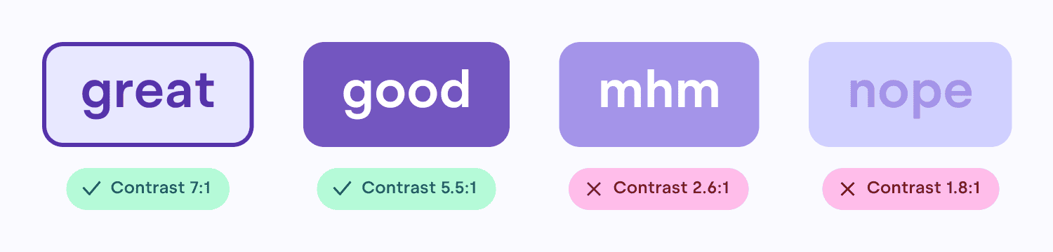
Mind the low
contrast
To ensure your content is accessible to everybody,
including people with visual impairments, text on a
colored background should have enough contrast to be
easily readable. There are plenty of apps or plugins
that can calculate that for you (I’ve included a few
references at the end of the article, check “Further
Reading”) — for the moment, all you really need to know
is that a contrast ratio of 4.5 or higher is
recommended.
Four buttons in a row.
The two leftmost buttons have sufficient color-contrast
ratio. The two buttons on the right have combinations of
colors that don’t provide enough contrast.
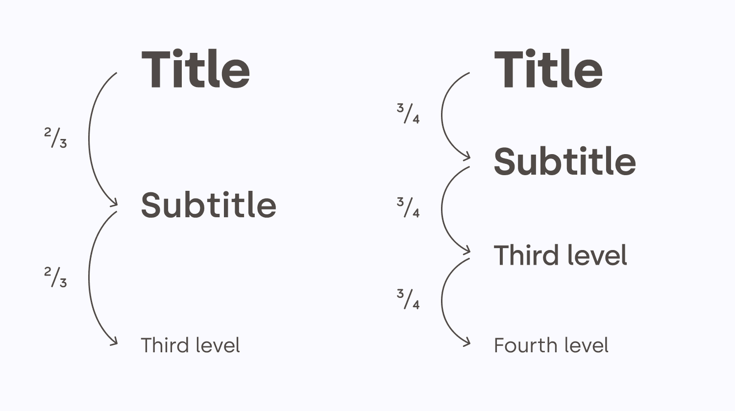
Text size contrast
Text size can be used as a very convenient tool for
structuring information. A well-structured text can
significantly lower the effort required for the viewer
to ingest the information. The contrast between each
heading level should be high enough for the structure to
be visible.
If it is possible, a consistent ratio between
different header levels usually looks more elegant. In
general, the weight of the text (bold, regular, light)
decreases as the level increases.
Two scales of text sizes,
side by side. On the left, the first row is a large text
header. Underneath it, the text is two thirds its
height, etc. On the right, in the other column, the
first row is the same large text as the left column.
Underneath it, the text is three quarters its height,
etc.
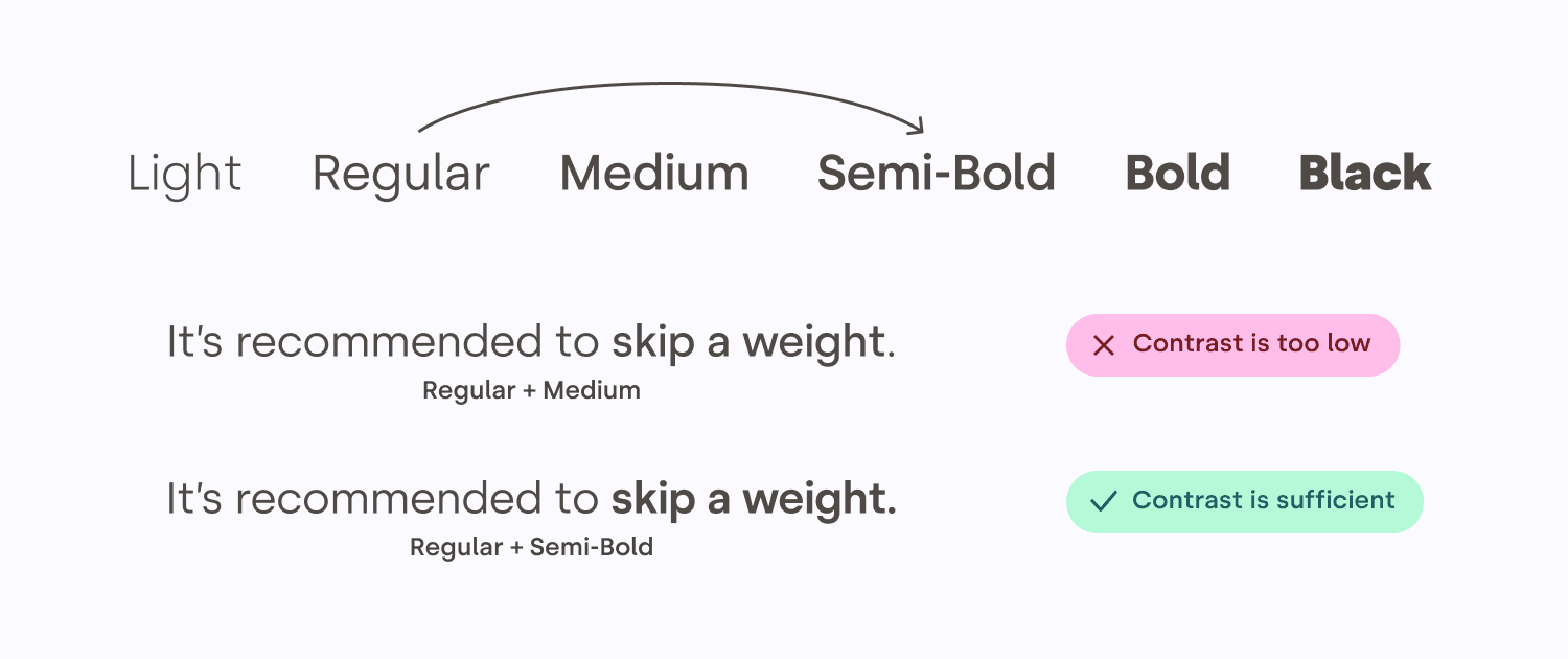
Text weight contrast
Sometimes, the typeface you are using comes with many
weights, like medium, semi-bold, light, etc. In those
cases, it’s usually recommended to skip one
weight when pairing them, to create enough contrast
between them.
A scale of the words:
thin, light, regular, medium, semi-bold, bold, heavy.
Each word is using its respective weight. Underneath,
two identical sentences. In the first one, half the
sentence is in regular, the other half in medium. The
contrast between the two is pretty low. In the second
sentence, the first half uses regular, but the second
half uses semi-bold, offering a much better
contrast.
Avoid
unintentional contrast
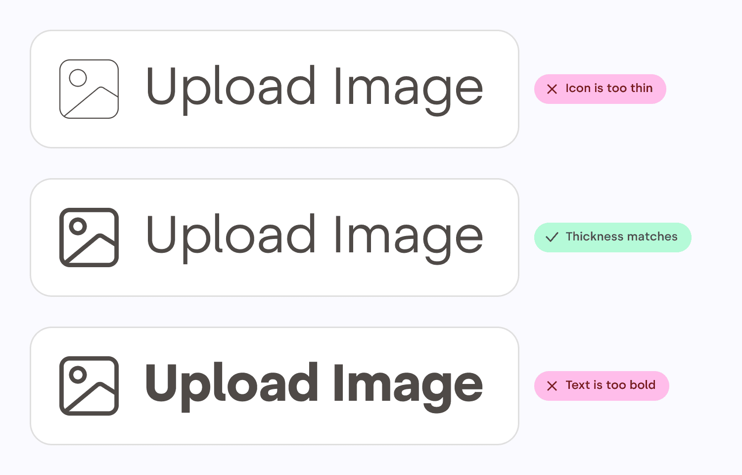
Combining text with an icon can help comprehension,
improve the visual appeal, or increase the importance of
an element. However, always make sure the thickness of
the text matches the thickness of the icon. That will
make it feel as if it were part of the typeface. It does
look more elegant, but it also saves your audience from
even thinking about it, which is a recurring theme in
graphic design. Good design is invisible!
Three pairs of icon and
text. On two of the pairs, the text is either thinner or
bolder than the icon. In the middle pair, the text and
the icon have matching thickness, and it looks like one
thing.
Conclusion
That might have surprised you, but creating and
iterating on designs isn’t about making things pretty.
Your job as a designer is to lower the cognitive
load for people to ingest the information,
create a rhythm that keeps your viewer
engaged, and make sure everybody can
access the content.
The most important advice I would give to emerging
designers — even those that have already won awards — is
that learning never stops. You can always
improve your craft, whether you’ve won one award, or
twenty. Remember, you’re never going to be an expert in
everything. I have worked on so many things, from book
design to exhibition design, hospitality, tech, and
everything in-between — and I’ve taken something new
from the experience every time. Now I’m the executive
creative director at a global agency, and I still find
myself learning something new every day. Lisa Smith
Next time you are faced with the need to design
something, I hope those tips will make you feel a little
bit more confident and comfortable! And remember,
everybody can be a designer, but every designer has a
lot to learn and to keep learning — it’s a
process that never stops.